DESIGN EXPERIENCE
Wedding Color Palette in Italy: Total White or Vibrant Color?
Wedding color palette in Italy — Explore expert tips, trending combinations, and how to create a cohesive look.
Wedding Design Guide
Wedding Color Palette in Italy
Total White or Vibrant Color? How to Choose the Right Palette for Your Destination Wedding
One of the first style decisions couples face when planning a destination wedding in Italy is:
Should we choose a total white wedding palette, or embrace color?
Both choices can be beautiful.
Total white feels timeless, elegant and refined.
Color feels expressive, personal and full of energy.
The right answer depends on your venue, season, landscape, personality and overall wedding vision.
In Italy, color should never be chosen in isolation. It should belong to the place where the wedding happens.
A historic villa in Tuscany, a lakefront venue on Lake Como, a coastal terrace on the Amalfi Coast and a countryside estate in Umbria all call for different visual choices.
Here is how to choose the right wedding color palette in Italy with intention, elegance and coherence.
The Timeless Beauty of a Total White Wedding in Italy
A total white floral design is not just a trend.
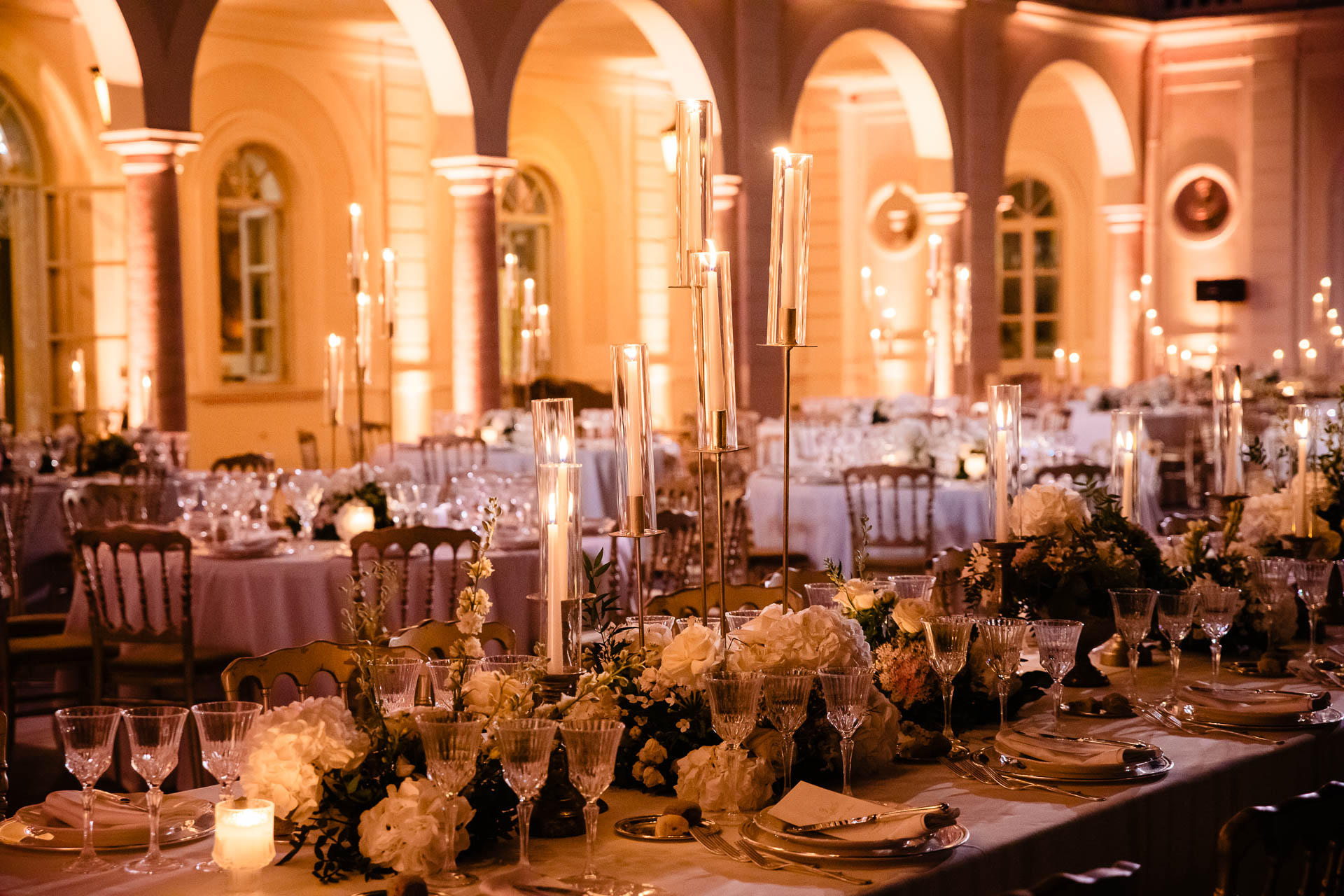
White flowers feel elegant, refined and effortlessly luxurious. They work especially well in Italy because the setting often already provides strong natural beauty, color and texture.
In a Tuscan villa, white flowers can soften warm stone, terracotta floors and historic architecture.
On Lake Como, they can enhance the clean elegance of the water, gardens and villas.
In Rome, they can feel timeless against grand churches, palaces and candlelit interiors.
Total white does not compete with the setting.
How to Style a Total White Wedding Palette
A white wedding palette can be minimal, romantic, classic or dramatic depending on how it is styled.
Beautiful pairings include:
white flowers with gold-rimmed tableware;
white roses, orchids or hydrangeas with crystal glassware;
white-on-white styling with soft linens and candlelight;
white florals with black accents for a modern editorial look;
white flowers with champagne, ivory and pearl tones for a softer result;
white floral installations with chandeliers or architectural lighting.
The secret is texture.
A total white palette can become flat if every element feels the same.
Mixing different flower shapes, linen textures, candle heights, tableware finishes and lighting can create depth without adding strong color.
Greenery can completely change the feeling of a white wedding.
Used sparingly, it keeps the design clean, elegant and sophisticated.
Used generously, it creates a more natural, garden-inspired or countryside atmosphere.
In a formal villa or palace, too much greenery can sometimes make the design feel less refined.
In a farmhouse, vineyard or olive grove, greenery can feel perfectly connected to the landscape.
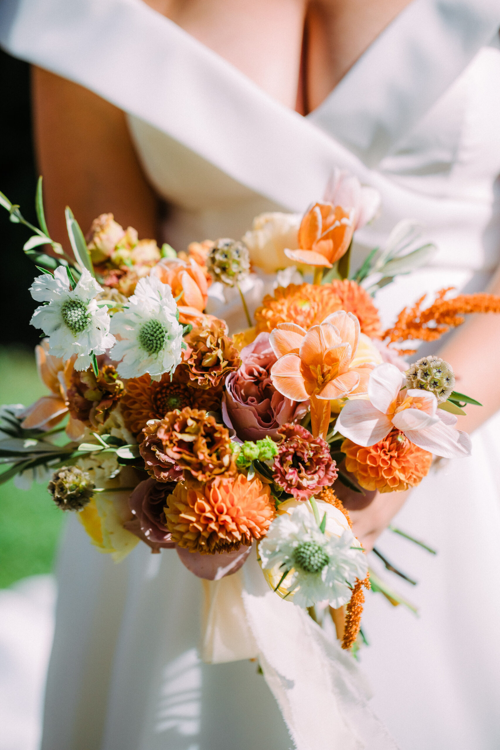
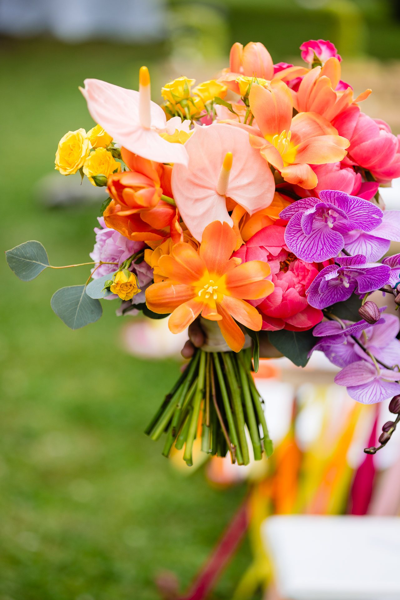
Color brings personality, energy and individuality to a destination wedding.
It can make the design feel more personal and less expected.
But color also requires more control.
A colorful wedding palette should feel intentional, not random.
The goal is not to add every color you love.
The goal is to build a palette that feels harmonious with the venue, season and mood of the day.
How to Use Color Elegantly in an Italian Wedding
Pair Color with White
One of the safest ways to introduce color is to ground it with white.
navy napkins with white florals;
terracotta accents with ivory flowers;
blush details with white table linens;
sage green stationery with soft white arrangements;
deep blue glassware with clean floral design.
White gives the palette breathing space.
It keeps color elegant rather than overwhelming.
Choose Harmonious Color Combinations
The most successful colorful weddings use tones that naturally work together.
Beautiful combinations for Italian destination weddings include:
navy blue and light blue;
forest green and sage;
blush pink and dusty rose;
terracotta, peach and ivory;
ochre, rust and soft cream;
lavender, mauve and champagne;
hot pink and orange, when styled with strong editorial intention.
Strong color can be beautiful, but it needs discipline.
Without a clear direction, colorful design can quickly feel chaotic.
Test the Palette in Context
A palette can look beautiful on Pinterest and completely different inside a real Italian venue.
Before finalizing colors, test them against the actual setting whenever possible.
the color of the venue walls;
the garden or landscape;
the table linens and chairs;
the bridal gown and bridesmaid dresses.
Natural light in Italy can be warm, golden and very strong, especially in summer.
Colors should be chosen with that reality in mind.
Natural Tones: The Perfect Middle Ground
If you are unsure between total white and vibrant color, natural tones can be the perfect middle ground.
These palettes feel soft, elegant and flexible.
They work beautifully across many Italian venues, from Tuscan villas to coastal terraces and countryside estates.
Some refined combinations include:
beige, sage green and dusty pink;
cream, taupe and soft gold;
terracotta, blush and ivory;
champagne, olive green and warm white;
stone, antique rose and muted green;
sand, ivory and soft peach.
Natural palettes are especially effective in Italy because they do not fight the landscape.
They allow the venue, food, flowers and atmosphere to feel part of the same visual story.
How the Venue Should Influence Your Wedding Palette
The venue should always guide the color palette.
A formal historic villa may call for whites, champagne, soft pastels or deep elegant tones.
A Tuscan farmhouse may work beautifully with olive green, terracotta, ivory and natural textures.
A lakefront villa may suit white, blue, silver, pale green or soft neutral palettes.
A coastal venue may support citrus tones, sea blues, bright whites or warm sunset colors.
A city wedding in Rome or Florence may feel stronger with classic whites, black accents, gold details or refined jewel tones.
The question is not only:
What colors do we like?
The better question is:
What colors belong in this place?
Total White or Vibrant Color: Which Is Better?
Total white is ideal if you want:
a timeless and refined look;
a clean luxury aesthetic;
a palette that will age well in photographs;
design that enhances rather than competes with the venue;
an elegant atmosphere for villas, palaces or formal settings.
Vibrant color is ideal if you want:
a wedding with stronger personality;
a more expressive visual identity;
a joyful, editorial or fashion-forward atmosphere;
seasonal design with warmth and depth;
a palette that reflects your energy as a couple.
Natural tones are ideal if you want:
softness and elegance;
a palette that feels warm but not too bold;
colors that work easily with Italian landscapes;
a timeless look with more depth than pure white;
a balance between classic and personal.
Work with Your Planner and Florist
Choosing a wedding palette can feel overwhelming, but you do not need to make the decision alone.
Your planner and florist can help align your vision with the venue, season, budget and overall guest experience.
They can also help you understand:
which flowers are available in your wedding month;
which colors photograph best in your venue;
where to use color for maximum impact;
where neutrals can create balance;
how to avoid over-designing the space;
how to repurpose ceremony flowers for the reception.
The strongest wedding palettes are not chosen randomly.
Frequently Asked Questions
Is a total white wedding palette too simple?
No. A total white wedding palette can feel extremely elegant when texture, proportion, lighting and flower choice are handled well. In many Italian venues, white design feels timeless and luxurious.
Can colorful wedding flowers look elegant in Italy?
Yes. Colorful flowers can look beautiful when the palette is intentional and connected to the venue, season and overall design. The key is harmony, not simply adding many colors.
What colors work best for a Tuscan wedding?
Tuscany often works beautifully with ivory, olive green, terracotta, dusty rose, sage, champagne, warm neutrals and soft gold. The best palette depends on the venue and season.
Should the wedding venue influence the color palette?
Yes. The venue should strongly influence the palette. Architecture, landscape, wall colors, flooring and natural light all affect how colors will feel in real life.
How do we choose between white and color?
Start with the feeling you want. White is timeless and refined. Color is expressive and personal. Natural tones offer a soft middle ground. Then test the palette against your venue and season.
Your wedding color palette should feel like you.
Whether you choose the clean elegance of total white, the energy of vibrant color or the softness of natural tones, the most important thing is coherence.
The colors should reflect your story, respect the venue and support the atmosphere you want to create.
This is your wedding.
Do not be afraid to explore, refine and trust your instincts.
In Italy, beauty is already part of the setting.
Your palette should simply help it speak.
Planning Your Wedding Design in Italy?
Dolce Promessa helps international couples create refined destination weddings across Tuscany, Lake Como, the Amalfi Coast, Rome and private Italian estates — with color palette guidance, floral direction, venue selection, budget clarity, trusted vendors and guest logistics.
Begin your wedding journey with us.
With care, Sofia Lead Planner & Experience Designer Dolce Promessa